Impressionism
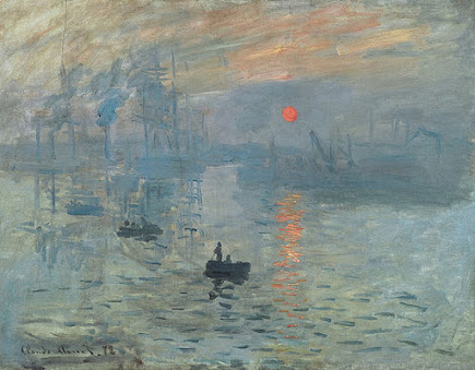 |
| Impression Sunrise by Claude Monet (1872). Created in Le Havre, France. |
 |
| Bal du moulin de la Galette by Pierre-Auguste Renoir (1876). Created at the rue Cortot in Paris. |
My Reaction
Impressionism art comes off as very aesthetically pleasing to me as a viewer. I really do like the way colors are nicely blending together even with the sketchiness of the paintings. Out of the two paintings I included, I would have to say that Impression Sunrise by Claude Monet comes off as the one I prefer to view. The colors and simplicity used in the work really stand out to me and look great! It is definitely a piece I would love to own myself and have somewhere around me as decoration. As far as the second painting I included Bal du moulin de la Galette by Pierre-Auguste Renoir, It comes off as too much of a cluttered canvas to me in appearance. With so much going on in an art piece its very hard for me to grasp any meaning to it upon observation. With that being said I would have to conclude that overall that when it comes to Impressionism art there are just certain pieces that I enjoy to view where some just do not have my interest what so ever.
The Art Elements of this Style:
1. Colors
When it comes to the element of color in impressionism art it can be accurately described as several dabs of color which all work to blend into one another. From looking at the canvas of Impression Sunrise by Claude Monet you can very clearly see how two very contrasting colors, a cool light blue and a warm reddish-orange are dabbled together to blend well. Where this is most significant to me is where you can see the reddish-orange reflection of the reddish-orange sun reflect in the light blue of the surface water blend without looking unfitting to the rest of the artwork. As well as this is seen in the upper canvas where there happens to be a reddish-orange in the sky that blends in nicely once again with the contrasting light blue.
Now when I take a look at the element of color used in Bal du moulin de la Galette by Pierre-Auguste Renoir the dabs of color used are much more complex and not as simple as just a reddish-orange and light blue. There are hints of multiple shades of blue, green, tan, yellow, red, and even a touch of purple thrown in that I notice. Therefore, there also isn't nearly as much color contrast as seen in the previous artwork Impression Sunrise by Claude Monet, however this just shows how well blended together all these colors turned out. Which emphasizes to me how the element of color in impressionism was just as well able to be complex as it is able to be simplistic.
2. Lines
The lines used in impressionism art are known to be described as sketchy and contain loose brush strokes. Which I would have to say that both of these two art works contain lines fitting these characteristics. In Impression Sunrise by Claude Monet you can see the pattern of loose brush strokes through out the canvas, which almost work to give it the appearance of a really fast sketch or drawing. Then in Bal du moulin de la Galette by Pierre-Auguste Renoir you can see the same style of sketchy lines and once again loose brush strokes. Where this really stands out to me is on the artifacts of clothing of the people depicted in the painting as they all have a similar pattern of brush strokes.
3. Shapes
The shapes included in impressionism come off almost as short of finishing. In the painting Impression Sunrise by Claude Monet this really stands out to me when looking at shapes of the boats shown to be on the surface water depicted as well as the passengers of the boats. The shape of the boat is just very round to me, and lacking finishing details to it that would give more to perfecting the shape of the vessel.
Then as I take a look at the use of shapes in the painting Bal du moulin de la Galette by Pierre-Auguste Renoir I notice the same characteristics as I did in Impression Sunrise by Claude Monet. Looking at the faces of the people depicted, the chair in the front, and the glasses on the table in the front they all have a round curvature shaping them. Which emphasizes to me once again the lack of detail and finishing as a characteristic of shapes used in the impressionism style of art.
4. Contrast
Contrast in the impressionism style of art is seen by in mainly in the works of color since the rough finishing of impressionism art makes it very easy to blend contrasting colors together in a way that stands out. In Impression Sunrise by Claude Monet this is most apparent once again due to the contrast between the colors of a grey-light blue and reddish-orange. The element of contrast also seems to make an appearance through the lighting of paintings. Almost in the form of a vertical gradient in the artwork Bal du moulin de la Galette by Pierre-Auguste Renoir. Where towards the bottom of the canvas it is more dark but as it vertically moves upwards and approach the trees at the top of the painting it gets lighter. Which I see as an interesting style characteristic of impressionism art.
Post-Impressionism
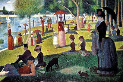 |
| Sunday Afternoon on the Island of La Grande Jatte by Georges Seurat (1884-1886). Painted in Paris, France. |
 |
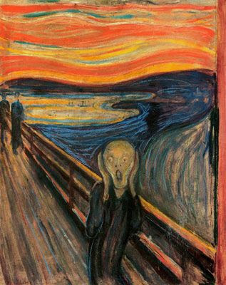
| The Scream by Edvard Munch (1893). Painted in Oslo, Norway. |
My Reaction Once again, most post-impressionism art for me is aesthetically pleasing to observe. I enjoy the vibrance, abstract, and distortion of the many art pieces of this style. The Scream by Edvard Munch honestly is a very awesome work of art in my eyes. It is a painting that I would definitely enjoy having in the presence of my household for decor. I like the eery and ominous feeling it generates for me. The detail I notice of the two figurers walking towards the man in the center also is a nice touch for this eery and ominous feeling that is left for viewers like me to interpret. Although, Sunday Afternoon on the Island of La Grande Jatte by Georges Seurat is a great work of art I personally am not the biggest fan of it. As it almost comes as generic to me therefore, it doesn't really work to generate a specific feeling for me when I observe it. This is an important trait for any artwork to have for me to have any remote interest towards it, regardless of his awesome technique of pointillism included in his many art works..
The Art Elements of this Style:
1. Colors
The use of color in post-impressionism art pieces is known for a psychological impact. When looking at the piece Sunday Afternoon on the Island of La Grande Jatte by Georges Seurat, the colors are all very vibrant, expressive, and abstract. There is many shades of green brought into the canvas that reflect the lighting and shadowing throughout its entirety.
However, in The Scream by Edvard Munch the colors are even more abstract, while less vibrant which in a sense creates a much different tone to the piece. Essentially creating an ominous theme for the viewers of the painting. From the upper portion of the portrait much warmer colors of red, orange, and yellow are seen. While the lower portion of the portrait includes contrasting colors of blue, and light grey. Which all come back to give the work its ominous feel to it upon inspection. From this I see that the element of color used in the post-impressionism artworks does give viewers a good psychological impact towards the theme and meaning of them.
2. Lines
Lines in the post-impressionism style of art come off as very warped and abstract. This can be seen with how they work to bring shapes together within the pieces. Sunday Afternoon on the Island of La Grande Jatte is a great example that shows Seurat's mastery of his technique, pointillism. Which in short is the applying of small dots of paint to precisely give lines in a painting and was a big technique used by several other post-impressionism artist.
The lines used in The Scream by Edvard Munch are noticeably abstract and distorted in a pattern that is seen through the portrait. You can see this in the several streaks of curvy warm colored lines of red, orange, and yellow at the upper portion of the portrait as well as in the many shades of blue in the middle. They also make a great appearance when looking at the dock which the individual is present on. Curvy lines, warped lines, and techniques like pointillism can be used the describe the element of lines used in post-impressionism art pieces.
3. Shapes
Similarly to the use of color in post-impressionism art, the use of shape is also known for its psychological impact. There is also a strong use of warping when it comes to shapes included in post-impressionism pieces, which is similar to the strong the use of warping when it comes to the lines seen. This is also what seems to give the strange appearances of the individuals depicted in the painting Sunday Afternoon on the Island of La Grande Jatte by Georges Seurat. What really makes this stand out to me is the shape of the lady with the umbrella in the right side of the canvas, as her lower body just is oddly shaped with a strange curvature to it. Especially in comparison to the shapes of the other women depicted in the piece, but there is a well detailed finished look to the shapes here.
When glancing at the use of shapes in The Scream by Edvard Munch, I see once again very distorted and warped shapes all over the place. The individual depicted in the center of the lower canvas has a extremely curvy and distinctly warped shape to his torso. As well as his the proportions of his hands and the shape of them which is also warped. All this creative warping of shapes pertaining to individual's that are depicted in post-impressionism artwork gives a great abstract feeling when combined with the other elements that can be seen. Which really does generate a sort of psychological impact towards observers as it really makes them think by adding on to the meaning, intention, and purpose of artist's painting.
4. Contrast
In post-impression art it seems that contrast is prominent in the aspects of light and shadows. I see this is the painting Sunday Afternoon on the Island of La Grande Jatte, by Georges Seurat where there are distinct depictions of shadow within the painting. Such as there is a great round shadow that captures the people enjoying the afternoon with their dogs that gives me the thought that there is a large tree giving them their shade, although there is no large tree actually visibly include in that portion of the canvas. You can also see smaller shadows given to the depictions of people further back from the larger, more distinct shadow that stands out. In Sunday Afternoon on the Island of La Grande Jatte, by Georges Seurat its almost following a distinct pattern of contrast in lighting from the bottom of the canvas being presented as more dark, then the center being the most luminescent, ending with the top segment of the canvas being brought back to a more gloomy contrast of lighting.
Then in The Scream by Edvard Munch its almost an all around gloomy and dim contrast when it comes. to lighting. Giving the painting a much more ominous representation in tone. However, the contrast that is seen with the colors is very interesting in comparison to what is seen in the piece Sunday Afternoon on the Island of La Grande Jatte, by Georges Seurat. Which goes to show that contrast in the style of post-impressionism art can be presented not only in aspects of lighting and shadowing, but also in the aspect of color contrast.
Impressionism vs. Post-Impressionism
Intentions of Impressionism and Post-Impressionism:
Impressionism was started as movement by a group of artist with similar intentions in their work. Impressionism artist focused on loosely finished art work with little appearance of effort to fully develop the imagery of their pieces. Much more simplistic art work was to come as a result of this. Where as post-impressionism was birthed by its artist in response to the impressionism movement, with the major intention of focusing on subjectivity of art pieces through the artist's perspective. Their also was an embraced importance for personal symbolic meaning to post-impressionism art.
My Preference:
Although I do like works of both impressionism art and post-impressionism art, I would have to come to the conclusion that I prefer the simpleness of impressionism art. I really like the work of Claude Monet. Impression Sunrise is a very aesthetically pleasing painting for me to look at despite how unfinished among many of his other works as well. I also think find it interesting how with the impressionism movement the artist were able to make such a big impact on the way we see art with their philosophy. Therefore, I would also have to conclude I am much more interested by the beliefs and perspectives of the impressionism artist compared to post-impressionism artist.
Gersh-Nesic, Beth. “A Beginner's Guide to Impressionism .” Khan Academy, 2021, www.khanacademy.org/humanities/becoming-modern/avant-garde-france/impressionism/a/a-beginners-guide-to-impressionism.
“Post-Impressionism Movement Overview.” The Art Story, www.theartstory.org/movement/post-impressionism/.
Amory, Dita. “Georges Seurat (1859–1891) and Neo-Impressionism.” Metmuseum.org, The Metropolitan Museum of Art, Oct. 2004, www.metmuseum.org/toah/hd/seni/hd_seni.htm.
Auricchio, Laura. “Claude Monet (1840–1926).” Metmuseum.org, The Metropolitan Museum of Art, Oct. 2004, www.metmuseum.org/toah/hd/cmon/hd_cmon.htm.


Dylan, amazing work on this post! You did a phenomenal job going into detail on each element with every piece you showcased. The comparison between the pieces and two styles is also very well done. You chose some of my favorite works from this time, the one I like the most being Impression Sunrise. I think the format of this post did a great job bringing the elects of each piece to light, and comparing them to the other works. I can agree with what you said for your preference on the pieces, as I too find the simplicity of Impressionism art to be appealing.
ReplyDeleteI have to agree with Kazden, Wonderful post! I really like the detail you included with the shapes, lines, and color. My favorite painter was also Claude Monet for this Era. The sunset painting was going to be one of my choices to cover but I had already listed two paintings that I liked already. I liked how you described the Impressionism Era and the Post Impressionism Era. Thanks for sharing.
ReplyDelete